
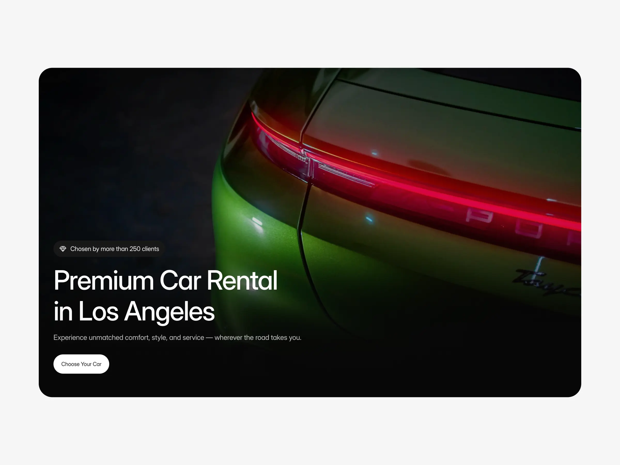
Luxerra
Luxerra is a clear example of a modern, booking-first car rental website. The homepage immediately establishes the main user action by guiding visitors toward choosing a vehicle without requiring unnecessary exploration.
The vehicle listing is structured around comparison. Cars are presented in a consistent layout, with key information placed predictably. This allows users to scan options quickly and understand differences without cognitive overload.
Individual vehicle pages continue the same logic. The layout keeps attention on the rental decision, with booking actions clearly separated from descriptive content. Navigation remains minimal, and secondary elements do not interrupt the main flow.
Overall, the site demonstrates how a clean structure and restrained interface help users move from browsing to booking with confidence.
View the website: https://luxerra.framer.website
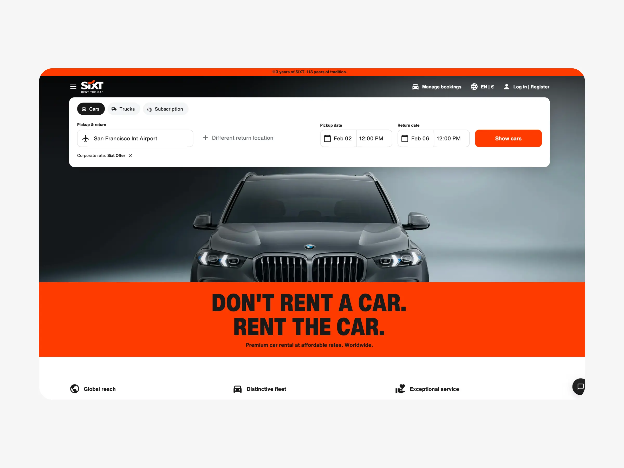
Sixt
Sixt represents a strong benchmark for large-scale car rental platforms. From the first screen, users are directed to the booking form, making the next step immediately obvious.
The inventory is designed for fast comparison. Each vehicle card follows the same structure, with pricing and core details shown early. This consistency reduces friction and helps users make decisions faster.
The interface avoids unnecessary elements that could distract from booking. As a result, the user journey remains predictable and focused on completing a reservation.
View the website: https://www.sixt.com
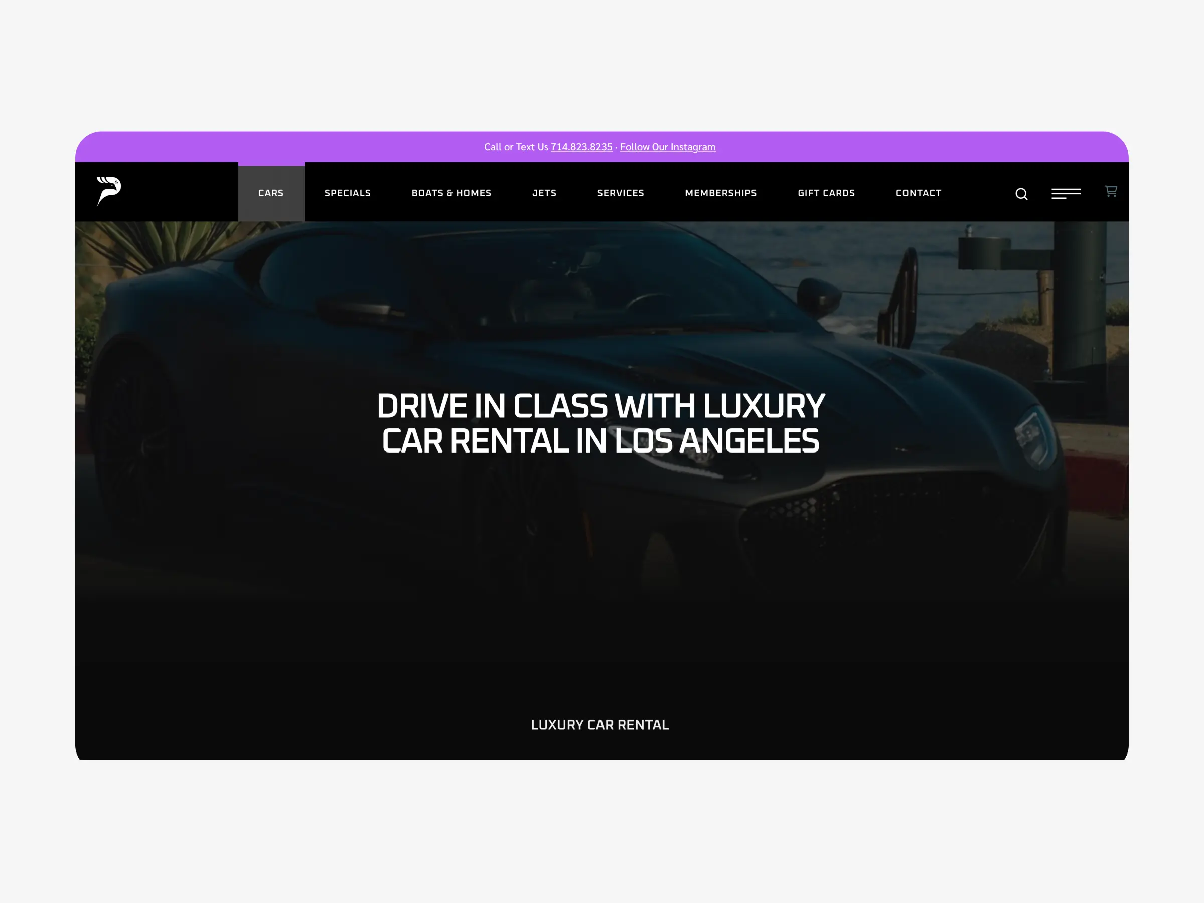
Peacock Rentals
Peacock Rentals uses a visually driven layout that places strong emphasis on showcasing available vehicles and establishing brand presence. The homepage clearly communicates the type of service offered and helps users quickly understand what to expect.
The vehicle catalog is organized in a straightforward way, allowing users to browse cars by category and explore available options with ease. Visual presentation plays an important role in guiding attention across the page.
Overall, the website balances vehicle presentation with accessibility, supporting exploration while still providing clear paths toward taking the next step in the rental process.
View the website: https://peacock-rentals.com
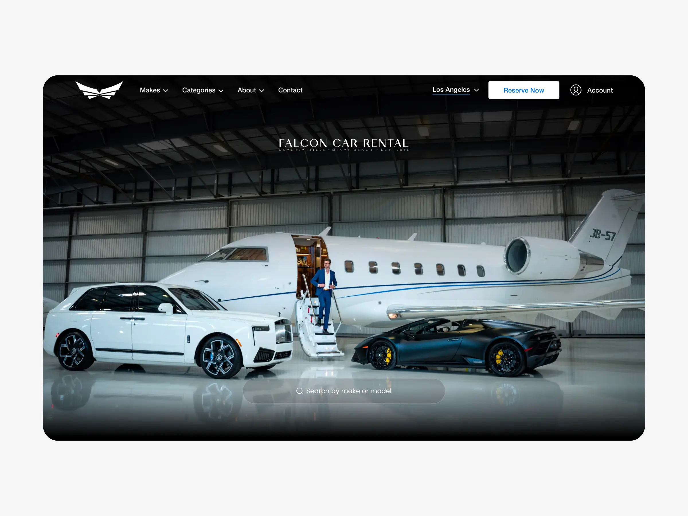
Falcon Car Rental
Falcon Car Rental uses a visually oriented website structure that places strong emphasis on presenting available vehicles and brand identity. The homepage introduces users to the fleet and service offering through large visuals and clear categorization.
The catalog allows users to browse vehicles in an organized way, with individual pages providing detailed information about each car. The overall layout encourages exploration and familiarization with available options before moving toward a booking decision.
The design reflects a presentation-focused approach, where users are guided through the inventory and service offering in a visually engaging and structured manner.
View the website: https://www.falconcarrental.com
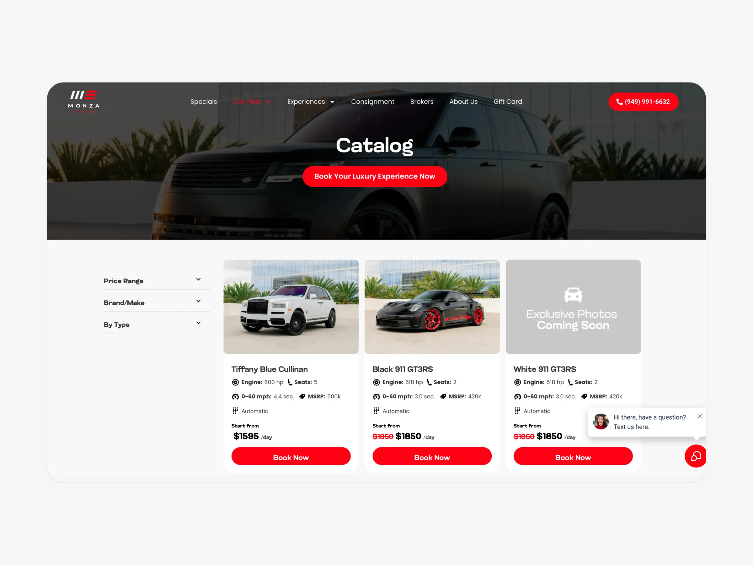
Monza Exotics
Monza Exotics features a content-rich layout designed to showcase its vehicle lineup and available services. The homepage combines vehicle presentation, informational sections, and navigation elements to give users a broad overview of the offering.
Vehicle pages provide detailed descriptions and visuals, allowing users to explore cars in depth. The structure supports browsing and discovery, giving users space to review options before proceeding further.
Overall, the website emphasizes exploration and information clarity, supporting users who prefer to review details before taking the next step.
View the website: https://monzaexotics.com
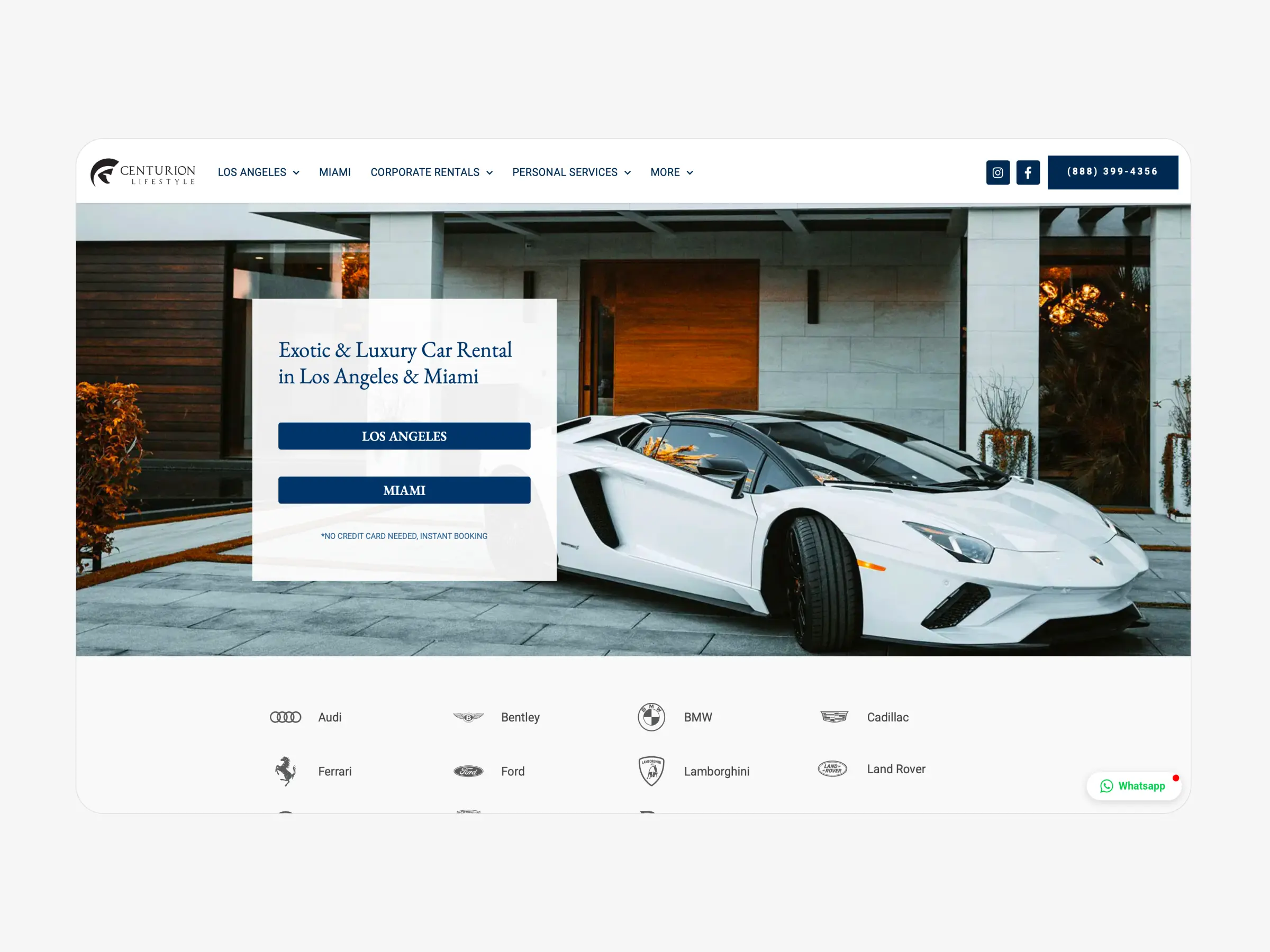
Centurion Lifestyle
Centurion Lifestyle follows a service-oriented website structure that highlights vehicle selection alongside direct communication options. The layout introduces users to the available fleet while emphasizing personal interaction as part of the rental process.
Vehicle listings are clearly presented, allowing users to review options and understand the scope of services offered. Calls to action guide users toward contacting the team to continue the rental process.
The design reflects a personalized service model, where the website acts as an entry point into a more tailored rental experience.
View the website: https://centurionlifestyle.com
Key observations
Across all examples, one pattern is consistent. Websites that prioritize booking visibility and structured comparison reduce friction and convert more effectively.
When booking actions are delayed or overshadowed by secondary elements, users hesitate. Clear hierarchy and predictable layouts consistently support faster decisions.
Conclusion
Effective car rental website design is defined by structure, not decoration. The fastest-growing sites make booking the primary action and remove anything that competes with it.
Real examples show that when clarity leads the interface, online bookings become a natural outcome rather than a forced conversion.