
Unclear Positioning
One of the most common mistakes on driving school websites is unclear positioning. Visitors often arrive with a simple question in mind: is this school relevant to me and my situation. When the website does not clearly explain who the school is for, what programs are offered, and how the learning process works, users struggle to understand value and leave without taking action.
Instead of immediately communicating course types, license categories, lesson formats, and timelines, many websites rely on generic slogans or vague promises. This creates friction at the very first interaction. A driving school website should quickly answer basic questions and guide users toward understanding programs and next steps. A clear structure helps users move forward with confidence, as explained in detail in Driving School Website Structure That Converts Visitors, where content order and decision logic are broken down step by step.
Weak Content Flow
Another frequent issue is poor content flow. Information is often presented in a random order, forcing visitors to scroll excessively or search for key details. Pricing may appear before programs are explained, trust signals may be hidden at the bottom of the page, and enrollment steps may be scattered across multiple sections.
This breaks the natural decision process. Users want to understand the offering first, then evaluate credibility, and only after that consider contacting or enrolling. When content does not follow this sequence, visitors hesitate because the website does not guide them logically. A well-structured driving school website reduces uncertainty by presenting information in a predictable and easy-to-follow way.
No Clear Enrollment Path
Many driving school websites fail to provide a clear enrollment path. Some rely on a single generic contact form, while others use multiple buttons with different labels that lead to the same unclear outcome. When users do not know what happens after clicking a button, they delay the decision or abandon the site entirely.
A conversion-focused website should clearly show how enrollment works, what information is required, and what the next step is. Whether it is booking a lesson, requesting a callback, or submitting an application, the action must feel simple and expected. Confusing enrollment paths are a key reason why many driving school websites fail to generate consistent inquiries, as explained in Why Most Driving School Websites Don’t Get Enrollments.
Missing Trust Signals
Driving schools operate in a trust-driven market. Visitors care about instructor qualifications, safety, location legitimacy, and real student outcomes. Websites that lack visible trust signals such as instructor profiles, clear contact information, real photos, or transparent policies often feel unreliable, even if the school itself is reputable.
Trust is built through clarity and structure, not decoration. When users can easily find who runs the school, where it is located, and how lessons are delivered, they feel more confident moving forward. Missing or hidden trust elements increase perceived risk and push users toward competitors with clearer information.
Overdesigned Layouts
Overdesigned layouts are another common mistake. Heavy animations, complex visuals, and creative layouts often distract users from important information and slow down page loading. Instead of supporting understanding, design becomes a barrier to decision-making.
A clean and minimal layout helps users focus on content rather than effects. Clear typography, simple sections, and predictable navigation make the website feel professional and reliable. Design should support structure and usability, not compete with them.
Poor Mobile Experience
A significant portion of driving school traffic comes from mobile devices, yet many websites still feel uncomfortable on smaller screens and fail to support fast decision making. Common problems include dense text blocks, hard-to-tap buttons, long unstructured pages, and forms that are difficult to complete on a phone.
When the mobile experience is frustrating, users leave quickly and rarely return to complete enrollment. A mobile-first structure ensures that key information is easy to scan, important actions are accessible, and forms are short and usable. Ignoring mobile usability directly reduces inquiries and enrollment opportunities.
Below is an example of a mobile-first driving school website layout designed around clarity and usability. The interface prioritizes readable typography, clear hierarchy, and accessible actions, making it easy for users to understand programs and start enrollment on smaller screens without friction.
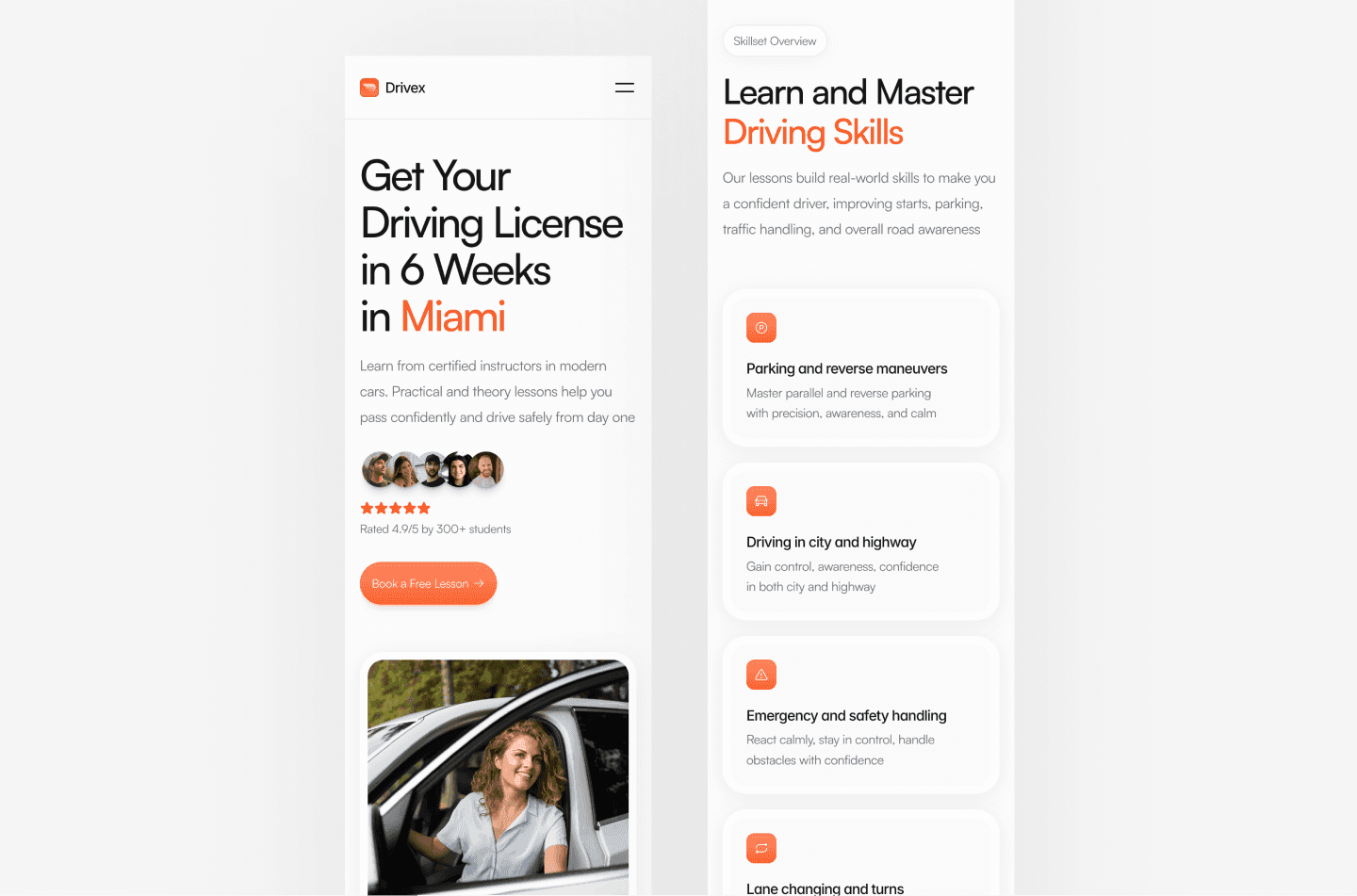
View a mobile-first driving school website example: https://drivex.framer.website
Conclusion
Most driving school website mistakes are not related to pricing or advertising but to structure and clarity. Unclear positioning, weak content flow, missing trust signals, and confusing enrollment paths prevent visitors from making confident decisions. A driving school website built around clear structure, logical order, and predictable actions performs better in search and converts more visitors into real students. Structure builds confidence, and confidence drives enrollment.