
The real goal of the page
The purpose of a financing or trade-in page is not to educate visitors about every possible condition, rate, or scenario. Its only real goal is to move the visitor one step forward and collect an inquiry. Many dealerships overload these pages with explanations, calculators, documents, and long forms, thinking that more information builds trust. In reality, too much detail slows people down and creates hesitation instead of confidence.
When visitors open a financing page, they are usually exploring possibilities, not making final decisions. They want to understand whether financing or trade-in is available and whether it is worth contacting the dealership. If the page answers this quickly and clearly, the next step feels natural. If it feels heavy or complicated, users leave and continue elsewhere.
Keep options simple
Financing and trade-in options should be presented at a high level. You do not need to explain rates, terms, or approval logic in detail. What matters is clarity and reassurance. Visitors should immediately understand that flexible options exist, that different budgets are supported, and that the process is handled with guidance from the dealership team.
Simple statements work better than long explanations. Instead of listing numbers and conditions, focus on what the customer gains. Flexibility, clarity, and support are easier to understand than percentages and legal wording. The more readable the page feels, the more confident users become about reaching out.
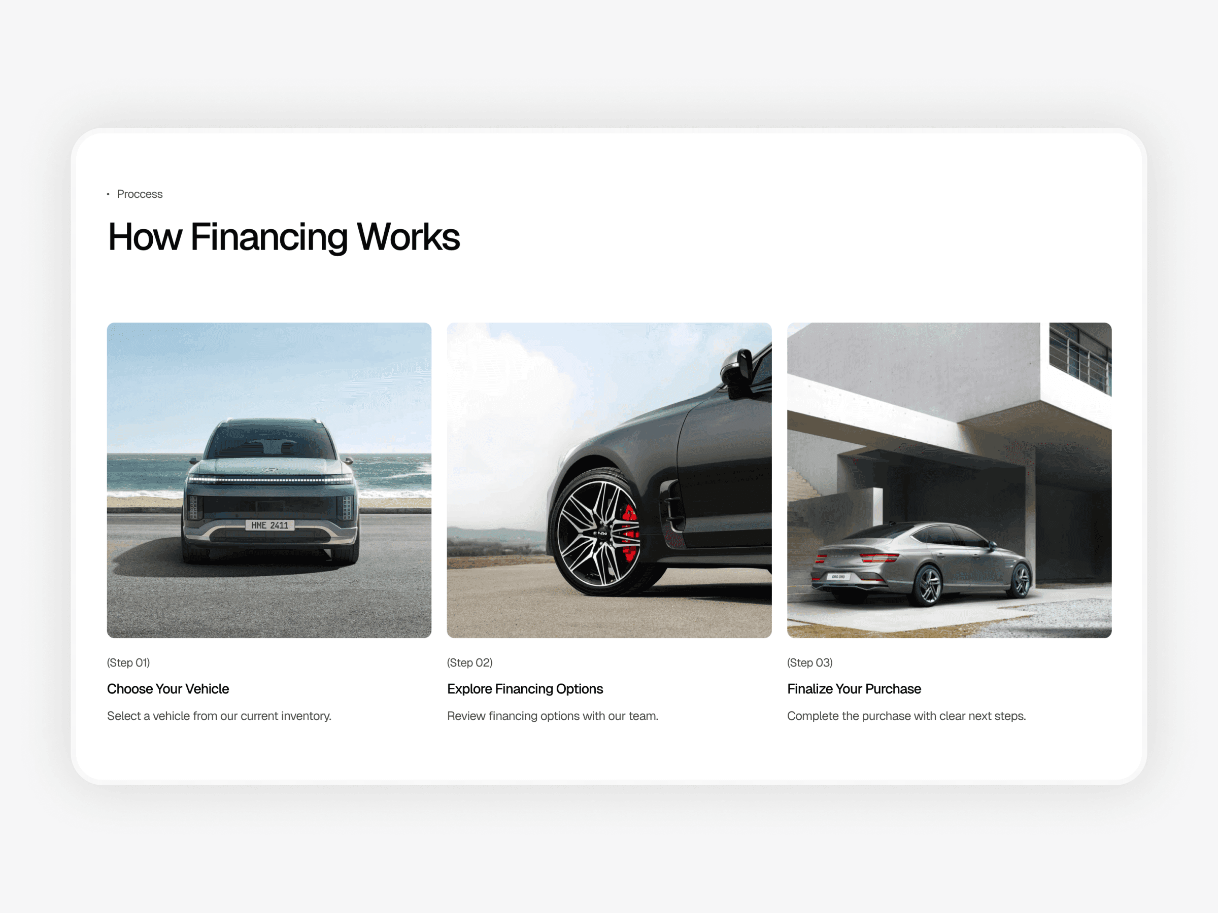
Show one clear process
A clear step-by-step process reduces uncertainty and builds trust. Financing feels stressful when people do not know what will happen next. A short process section solves this by showing that everything is predictable and manageable. Three simple steps are usually enough: choose a vehicle, discuss options, finalize the purchase.
This structure reassures visitors that they are not committing to anything too early. It also signals that the dealership is organized and professional. When people see a clear flow, they stop overthinking and focus on the next action instead of possible risks.
Limit required information
One of the biggest conversion killers on financing pages is asking for too much information upfront. Long forms feel like applications, not conversations. At this stage, visitors are not ready to share documents, income details, or personal data beyond basic contact information.
A good financing form collects only what is necessary to start a conversation. Name, phone number, budget range, and an optional message are enough. This lowers resistance and increases inquiries. More details can always be discussed later, after trust is established.
Use visuals to support clarity
Images should support understanding, not distract from it. Clean vehicle visuals, calm lighting, and realistic settings help visitors imagine the outcome without feeling overwhelmed. Avoid busy layouts, heavy overlays, or emotional imagery that shifts attention away from the message and reduces overall page clarity.
A single screenshot of a well-structured financing page can also help explain how information should be organized visually.
A clean example of a financing page with a clear process and a single inquiry form: https://drivehub-template.framer.website
Visual clarity reinforces the same message as the text: this process is simple, controlled, and easy to start for new buyers without unnecessary friction.
Focus on one action
Every financing and trade-in page should guide visitors toward one primary action. This action is usually submitting a request or contacting the dealership. Secondary links and distractions weaken this focus and reduce conversions.
The call to action should be clear, calm, and visible without pressure. Phrases like “Get Financing Options” or “Discuss Financing” feel safer than aggressive sales language. The goal is to invite a conversation, not force a decision. When users feel in control, they are more likely to take the next step.
Why this approach works
Clear structure reduces mental effort. When visitors do not have to think about what to do or what will happen next, they feel more confident. Financing and trade-in decisions are emotional and uncertain by nature, so clarity becomes a form of trust.
Pages that focus on simplicity consistently perform better because they respect the visitor’s stage in the decision process. Instead of trying to close too early, they guide users forward step by step. This leads to more inquiries and better quality conversations.
Conclusion
A strong financing and trade-in page is not about details. It is about direction. By keeping options simple, showing a clear process, limiting required information, and focusing on one action, dealerships can turn hesitant visitors into real inquiries.
Clear pages reduce friction, build confidence, and make the next step obvious. When structure replaces complexity, financing becomes easier to understand and easier to start. If you want to go deeper into how structure and clarity influence buyer confidence across the entire site, see What Makes a Car Dealership Website Trustworthy, where this principle is explained in more detail.