
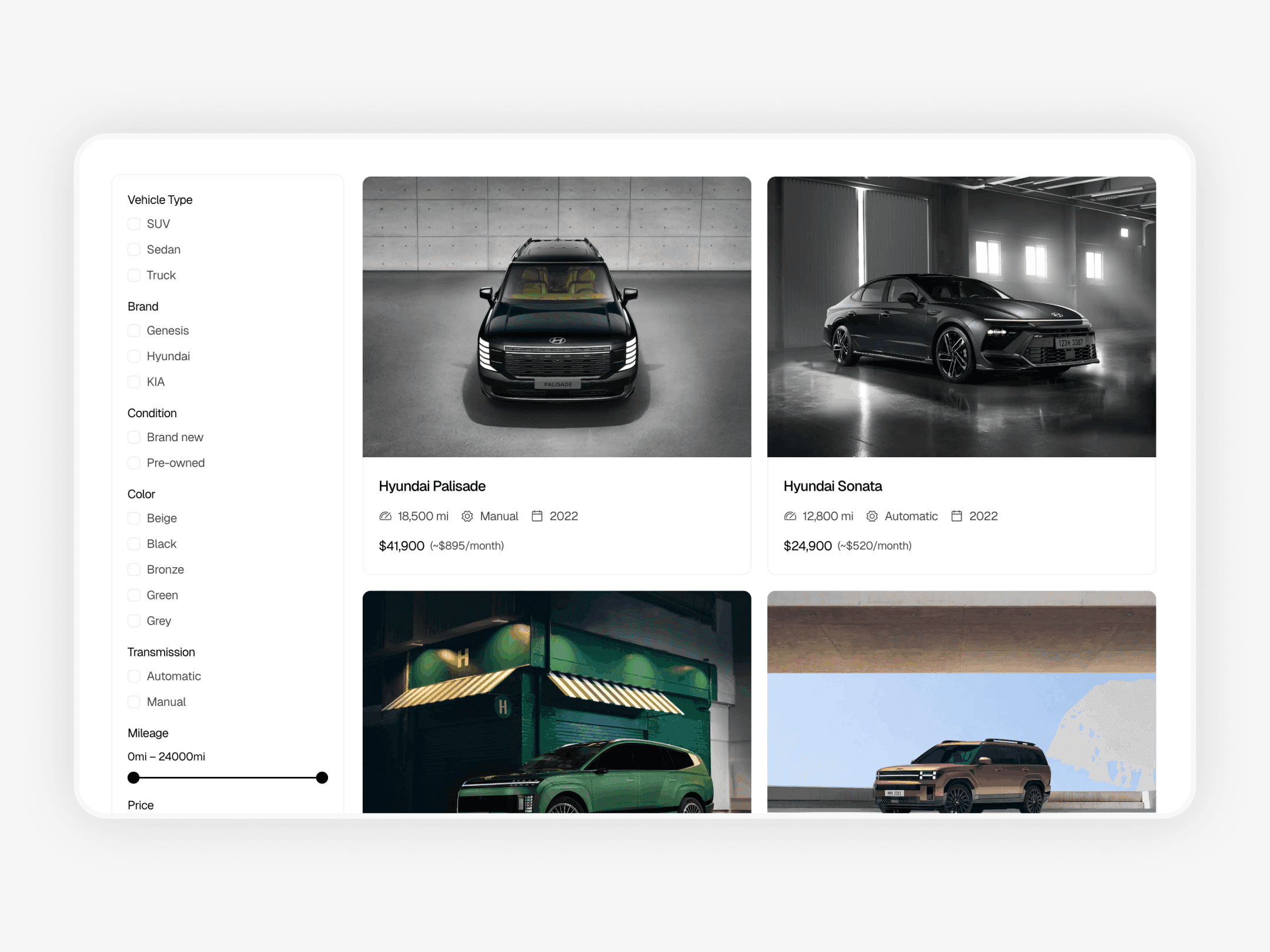
First view of the inventory
When users open the inventory page, they try to understand if the selection feels clear and manageable. They look at how many vehicles are available, how information is presented, and if the page feels calm or overwhelming. If the layout looks dense or chaotic, users feel pressure instead of control and leave without exploring further.
At this stage, users are not ready to make decisions or apply filters. They are orienting themselves. A clean layout with consistent vehicle cards, visible prices, and clear labels helps users feel comfortable continuing to browse and understand what the dealership offers.
Scanning before filtering
Most users scroll through several vehicles before interacting with filters or search. This scanning phase helps them build a rough understanding of price ranges, vehicle types, and overall quality. They compare options visually and mentally, even without clicking into individual vehicle pages.
If vehicle cards contain too much information or inconsistent layouts, scanning becomes tiring and confusing. Clear hierarchy inside each card allows users to process information quickly and move forward naturally instead of feeling overwhelmed.
Narrowing the selection
After scanning, users begin narrowing their choices. This usually starts with simple actions such as adjusting price range or selecting a vehicle type. At this point, users expect the inventory to respond clearly and predictably. Filters should help users reduce options step by step, not force them into sudden or confusing results.
A well structured inventory allows gradual narrowing. Users apply one filter, review the results, and then refine their selection further. This mirrors how people think and make decisions, reducing frustration and increasing confidence.
Using sorting and search
Sorting and search support users who already have clearer preferences. Sorting helps prioritize what matters most, such as lowest price or newest vehicles. Search helps users quickly check specific models or brands they already have in mind.
These tools should be easy to find but not dominate the interface. When sorting and search feel optional and simple, users feel in control of their browsing experience rather than pushed into a rigid flow from the first interaction.
Example of a car dealership website with inventory filtering: https://drivehub-template.framer.website
Comparing options
As the selection becomes smaller, comparison becomes the main activity. Users move between vehicle cards and detail pages, checking differences in price, condition, and specifications. Consistency plays a major role here. If information is missing or presented differently across vehicles, comparison becomes difficult and slows decision making.
A well structured inventory supports comparison by keeping structure and information consistent. This makes differences between vehicles easy to understand and helps users move to a decision with minimal effort required.
Handling empty results
Empty results often cause users to abandon inventory pages. When filters return no vehicles, users may assume the dealership does not have suitable options. A good inventory treats empty results as guidance, not a dead end, by explaining what happened and suggesting how to adjust the selection.
This keeps users engaged and encourages them to continue exploring instead of leaving the site altogether during the vehicle selection process.
Pagination and continuity
How vehicles load also affects navigation. Pagination or loading more vehicles should feel stable and predictable. Losing filter settings or jumping back to the top of the page breaks the browsing flow and frustrates users.
Continuity helps users stay focused on comparing vehicles instead of reorienting themselves. When navigation feels stable, users spend more time exploring the inventory.
Conclusion
Users navigate vehicle inventory in clear stages. They scan options, narrow choices, compare vehicles, and then decide whether to take action. This process works best when inventory pages feel calm, predictable, and easy to understand, allowing users to focus on choosing vehicles instead of figuring out how the page works.
Clear navigation is not about adding more features or complexity. It is about guiding users through choices with confidence and reducing unnecessary friction. If you want to understand how layout and page structure shape this experience from the first visit, you can also read Car Dealership Website Inventory Structure.